Did you get an amazing new brand designed, but 6 months in you are horrified to find a version of your logo in a striking shade of puce? (apologies, if your brand colour, is puce. ) You question where all that work went, or if they just don’t like the new brand. In most cases, they like your new brand just fine, but time is money and they just want to stick your logo on whatever they are creating and job done. Sound familiar? It might be time to look at your brand guidelines or even write some.
But does a consistent brand really matter?
In the end isn’t it just a logo and a few brand colours are you just being too precious over it? Brand consistency is important. We live in a noisy world and a consistent brand gets its message across faster and with a greater impact. We recognize big brands because they are consistent, we trust their familiar voice and comforting appearance. Just look at the Nike swish or the Coca-cola red and you know exactly who they are and what they stand for, without them having to say anything. This is down to years of careful conditioning and effective brand placement.
If a consistent brand is important where do you start?
Brand Purpose and Mission: Clearly define the overarching purpose and mission of the brand, highlighting its core values and principles.
Brand Identity: Provide guidelines for the visual elements that represent the brand, including the logo, color palette, typography, and imagery style. Specify rules for logo usage, sizing, placement, and clear space requirements.
Tone of Voice: Outline the brand’s preferred style of communication, including the tone, language, and messaging guidelines to maintain consistency in written and verbal communication.
Brand Usage: Detail how the brand should be used across various mediums and platforms, including guidelines for print materials, digital assets, signage, packaging, and advertisements. Include specifications for sizing, resolution, and file formats.
Brand Assets and Templates: Provide access to brand assets, such as logo files, image libraries, and templates for various materials, to ensure consistency and ease of use across different teams and departments.
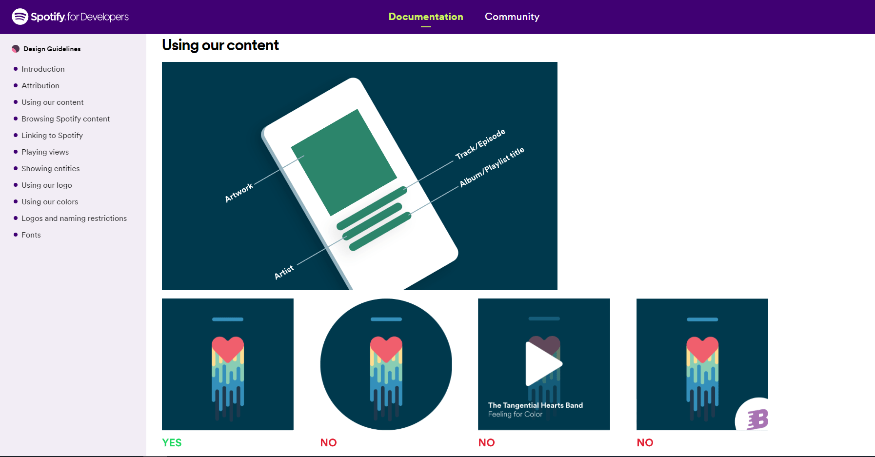
Examples and Visual References: Include visual examples and reference materials to illustrate how the brand should be implemented in different contexts, demonstrating correct and incorrect usage.
Legal Considerations: Include legal guidelines and usage restrictions, such as trademark usage, copyrights, disclaimers, and any specific legal requirements related to the brand.
Edit it down to keep it useful: After your first draft edit it down and keep it to the keep information needed. If you write war and peace no one will use it as you have wasted your time.
Get Inspiration from some big brands doing it well
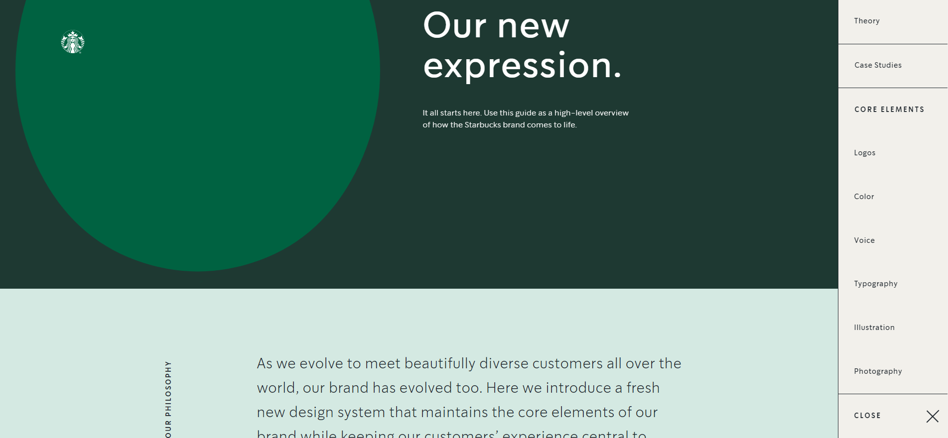
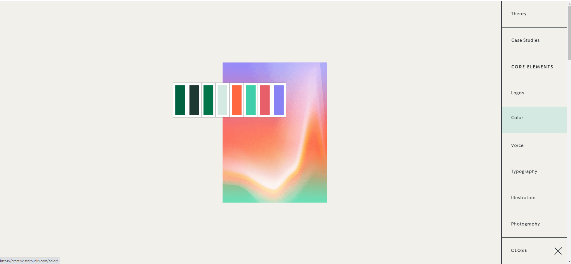
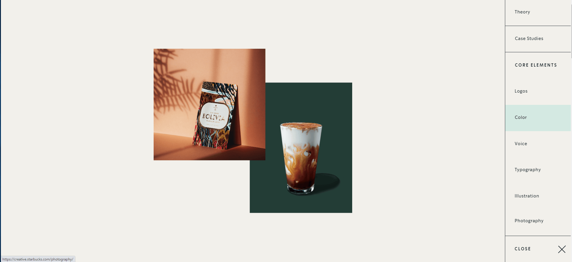
Starbucks
https://creative.starbucks.com/
A simple easy to flick-through website that captures the key features of their brand. A functional minimalist tone with earth colors and their ever-present brand green.
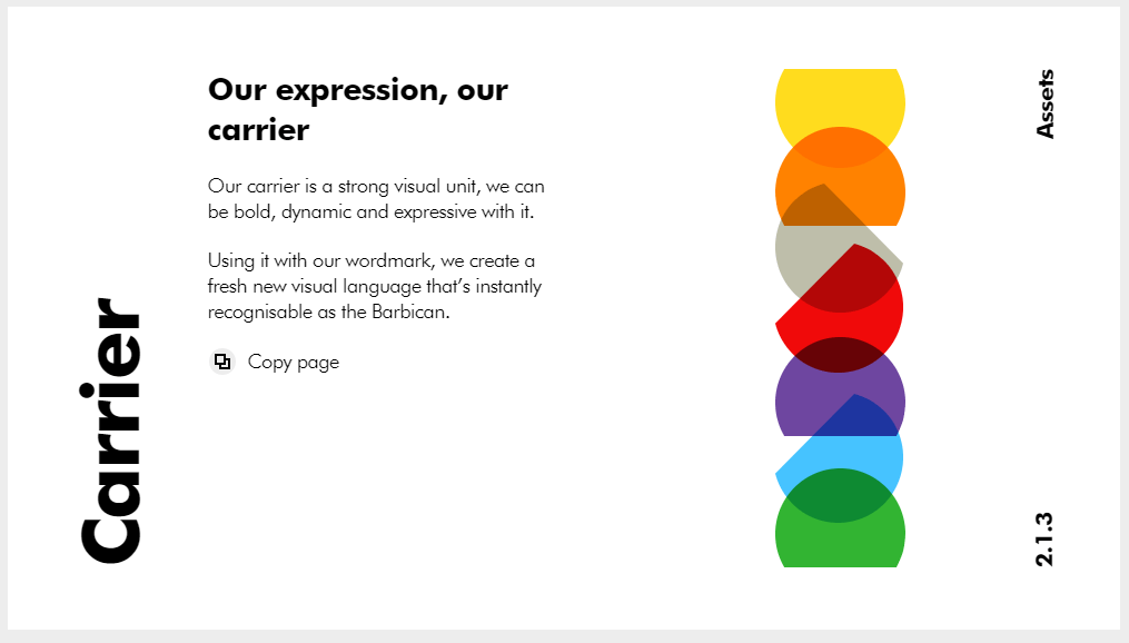
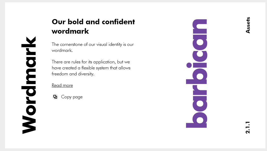
The Barbican
https://guidelines.barbican.org.uk/brand/
Their guidelines are more than just a logo. Taking you through their bold minimalist style, with strong typography and sharp splashes of their brand colors, even down to the subtleties of letter crops.

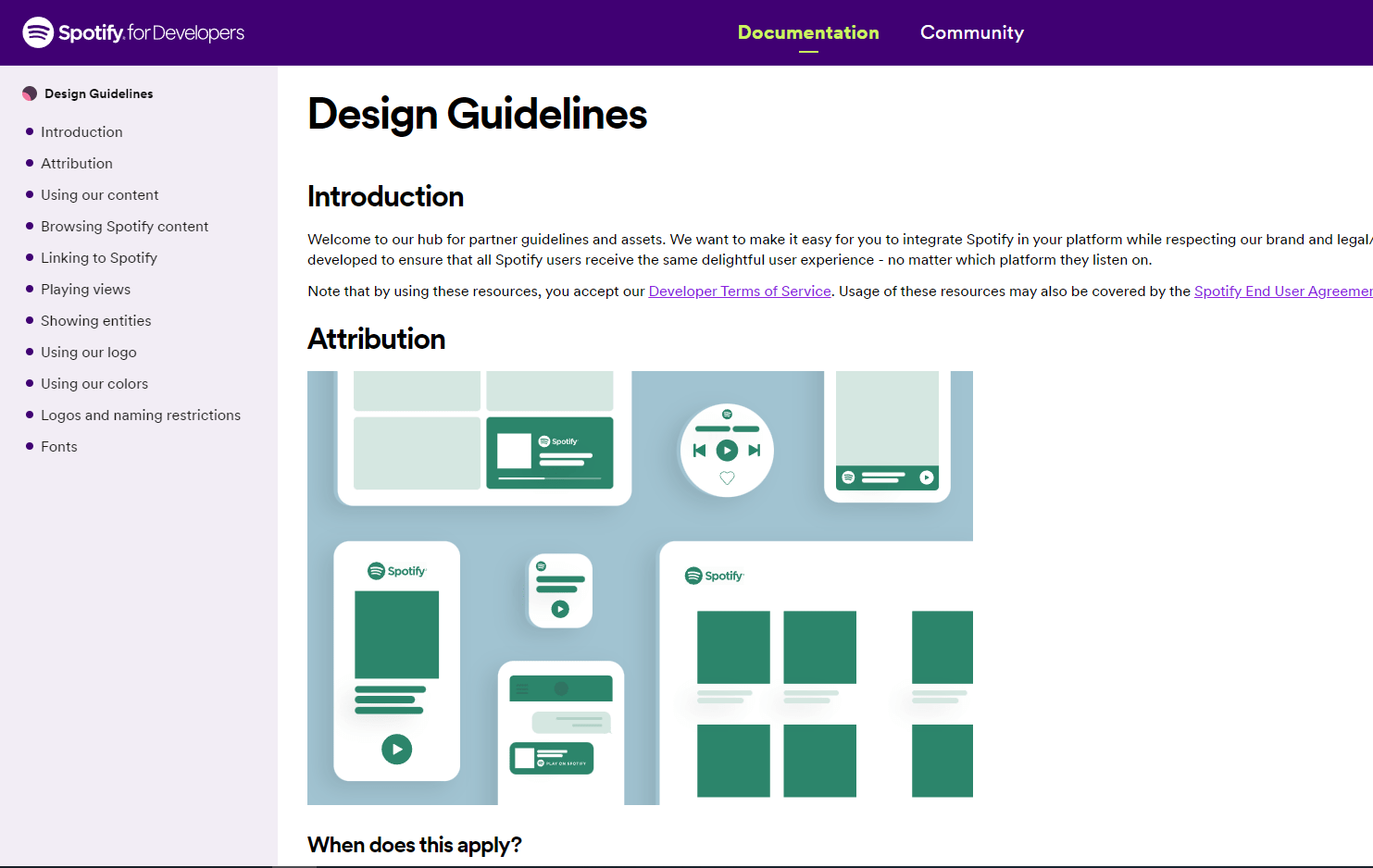
Spotify
https://developer.spotify.com/documentation/design
Want to see Guidelines that cover different devices then Spotify are a good example showing how to use their brand on multiple ui’s and screen sizes.
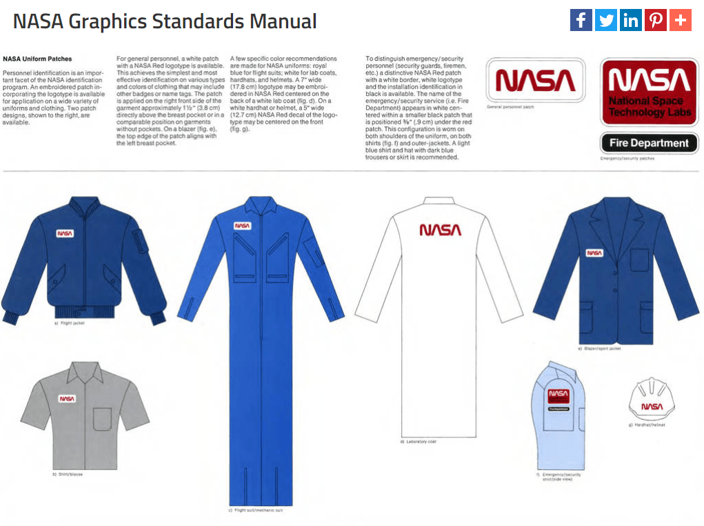
Nasa
https://www.nasa.gov/image-feature/nasa-graphics-standards-manual/
Even Nasa needs brand guidelines with its slick typography and including how to treat its brand on various spaceships and uniforms.